Vimy Brewing Company is a small craft brewery located in Little Italy in Ottawa. They were founded by two brothers who are former reservists in the Royal Canadian Navy. The company represents Canada and Canadian achievements by brewing small batches of beer using high quality ingredients.
The goal of this project was to redesign Vimy’s logo, simplifying it and giving them a more modern appearance in order to attract a wider audience and to help them stand out amongst many other craft beers.
The process began with a lot of research on the company and what they represent as well as the local and national craft beer market.
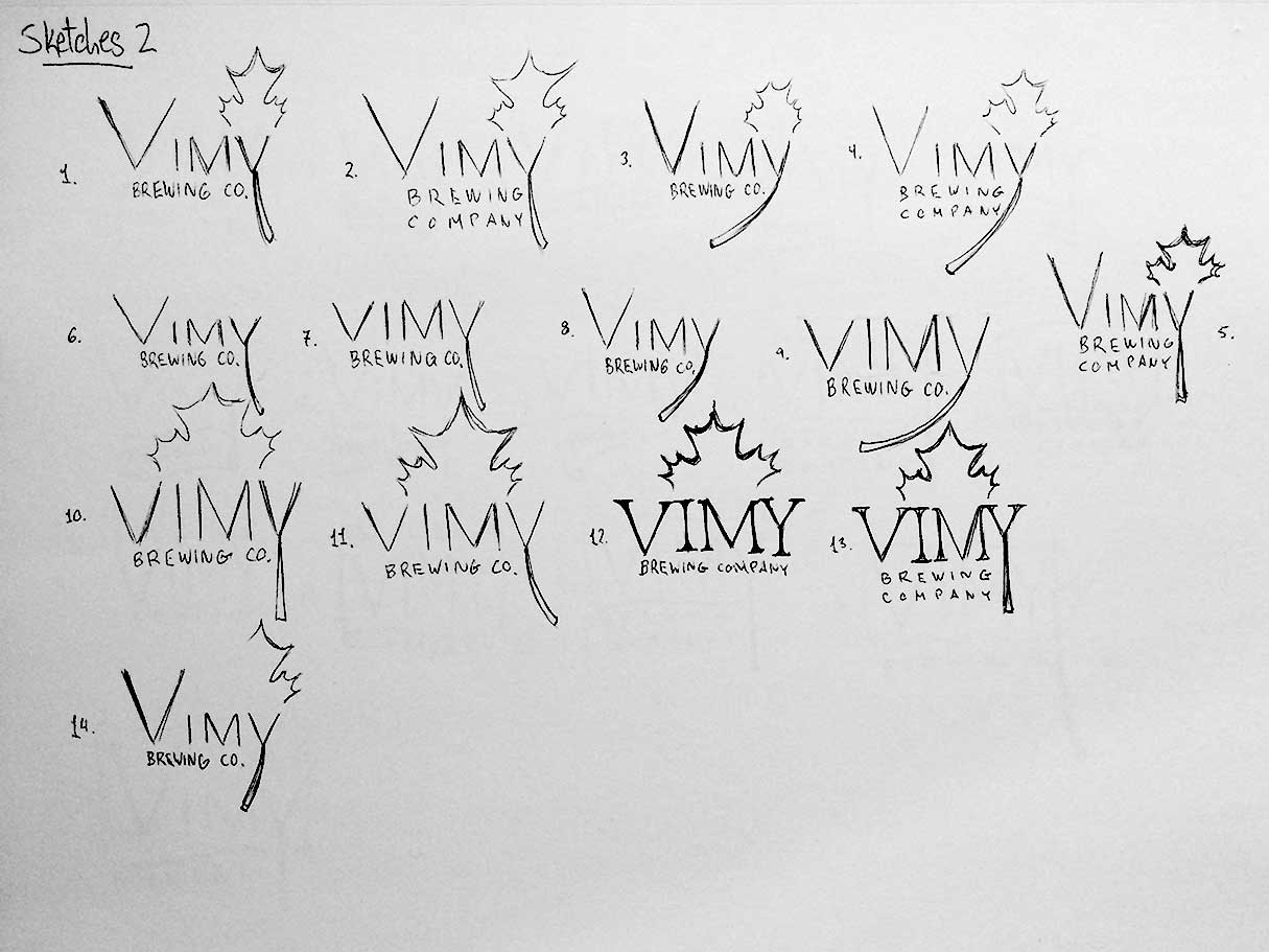
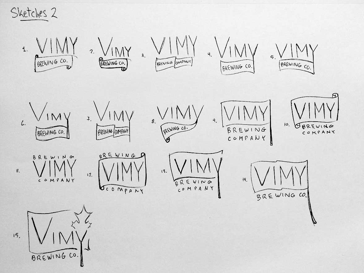
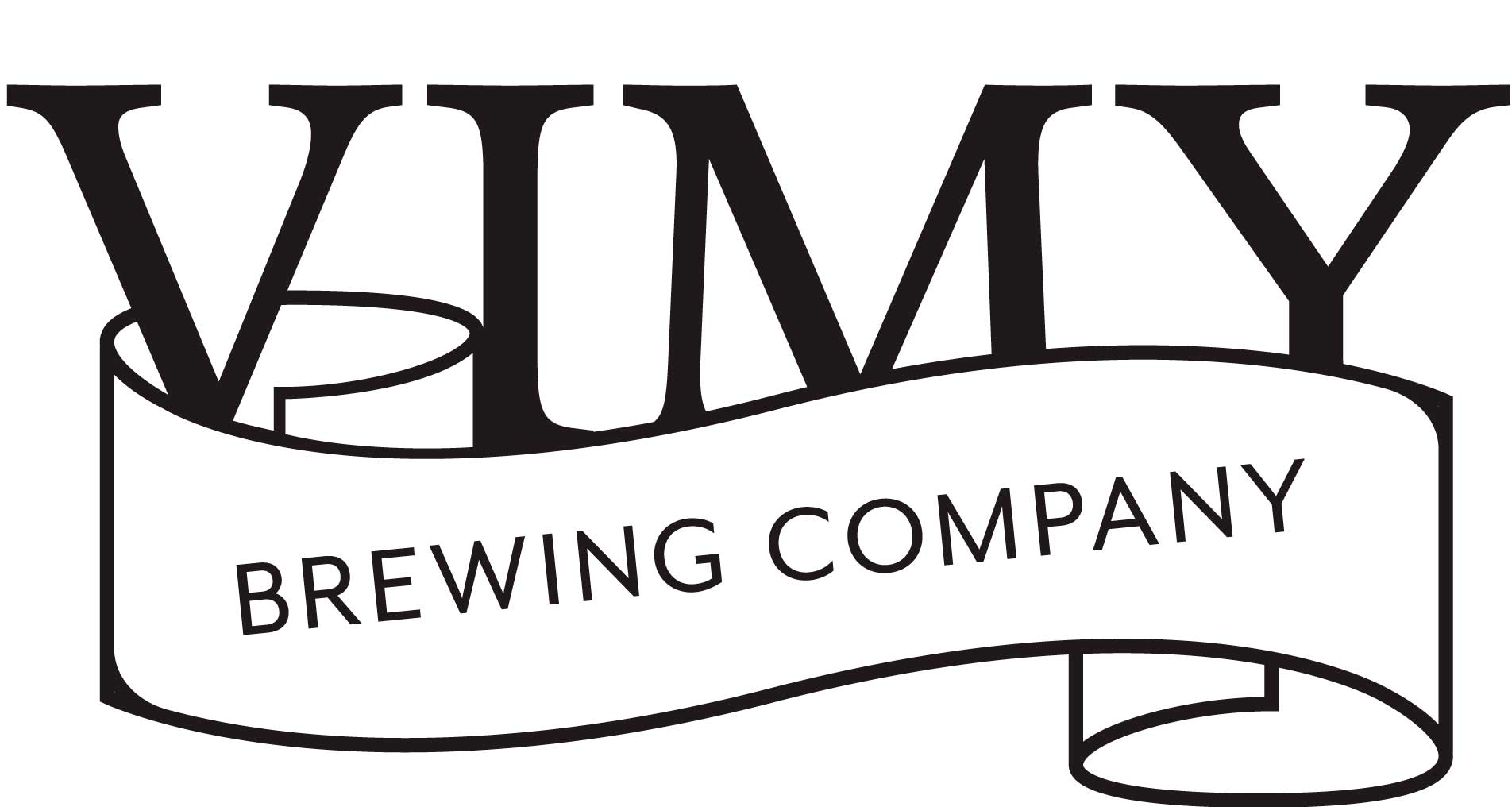
After many rounds of concept sketching, 2 logo design concepts were settled upon.

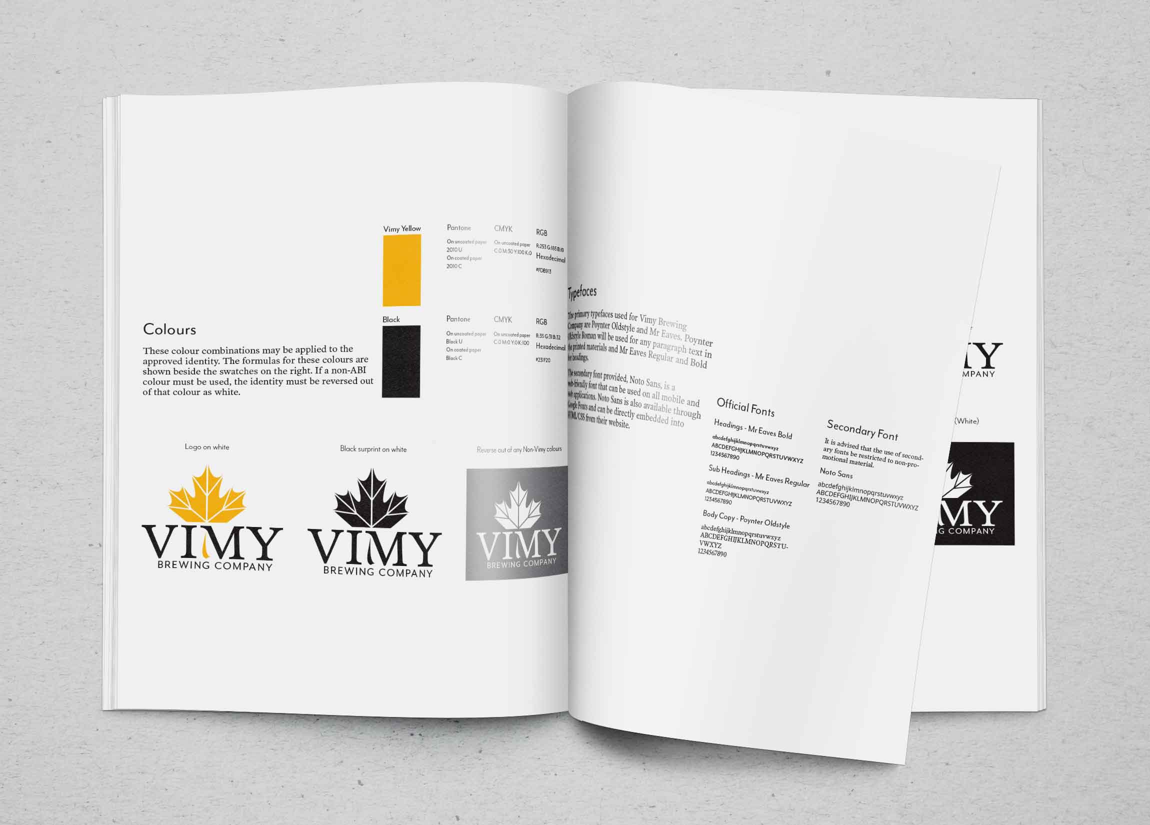
The second concept was selected out of the two and logo refinements began. In order to make it more interesting and unique, the stem of the maple leaf was integrated into the typography. The completed logo consists of a black and white version and a colour version, in which a deep yellow was picked. This choice was inspired by the vibrant colours of autumn leaves as they change.


The final deliverable of this project was a logo standards guide for Vimy Brewing Company. It highlights important information such as the preferred identity, clear space requirements, minimum size, colour use, and typography. Also included is an example of how the new logo could be used on Vimy products.
