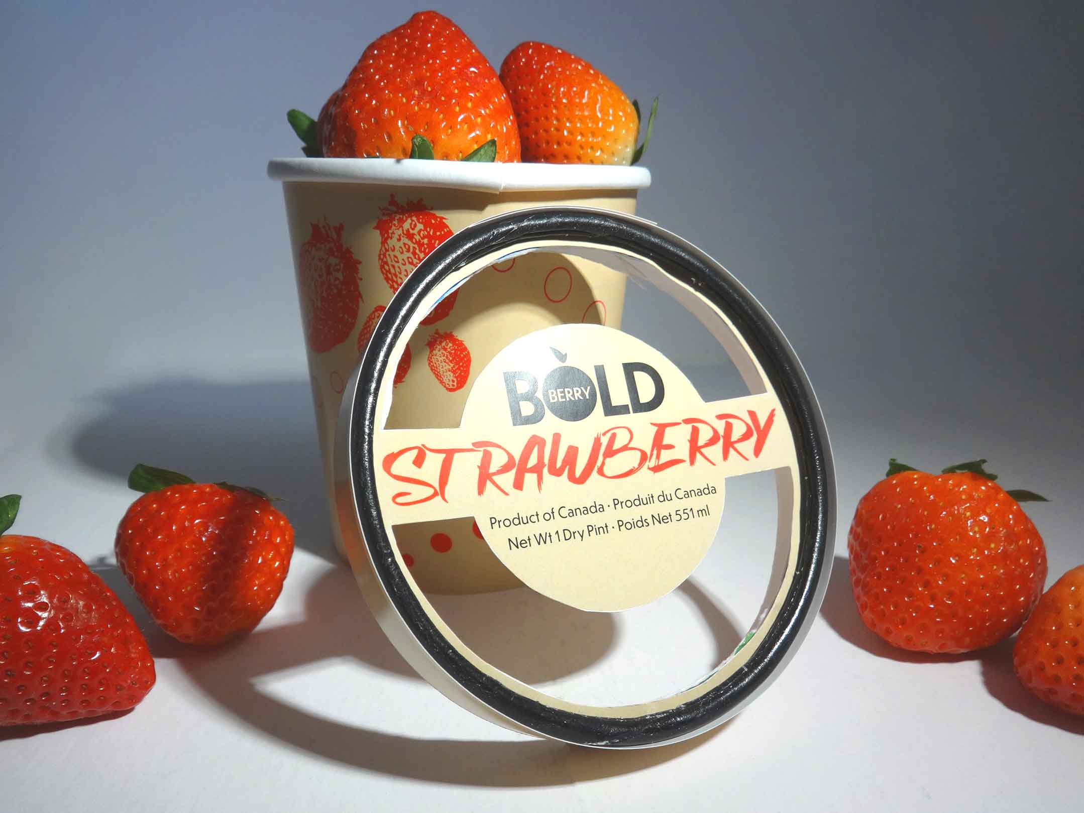
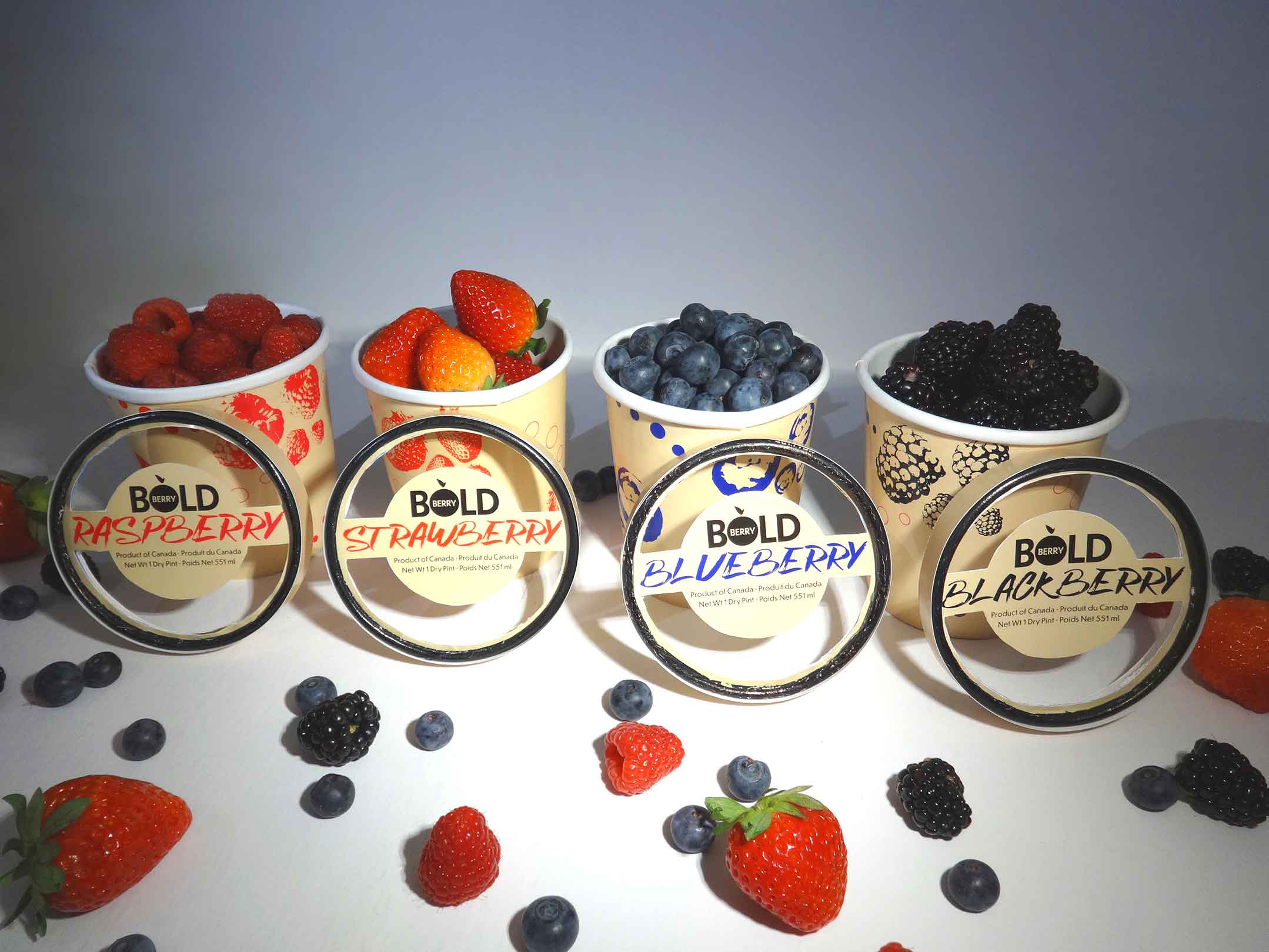
The goal of this project was to design the branding and packaging for a series of food products that I invented. I selected fresh berries as the products I would design for and named the brand “BoldBerry”.
BoldBerry sells fresh berries of all sorts and their target audience is hip young adults who are interested in a healthy natural diet and lifestyle.
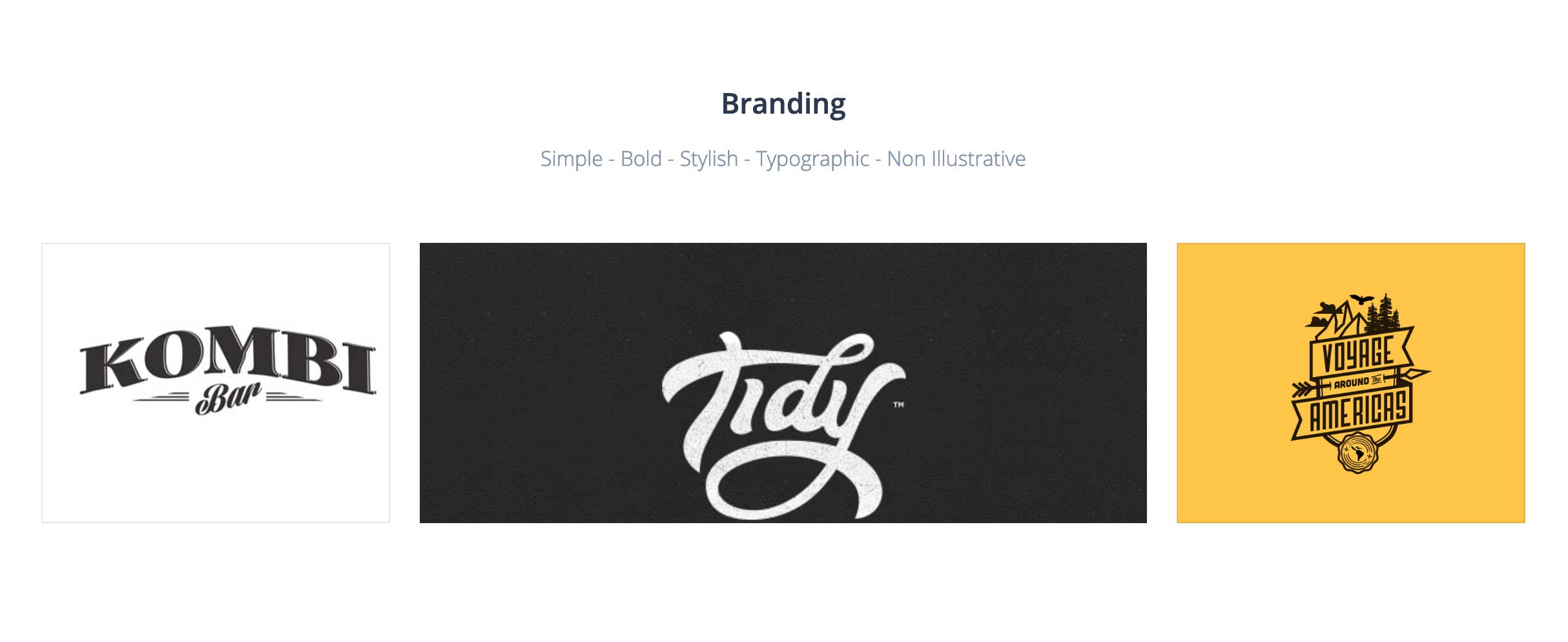
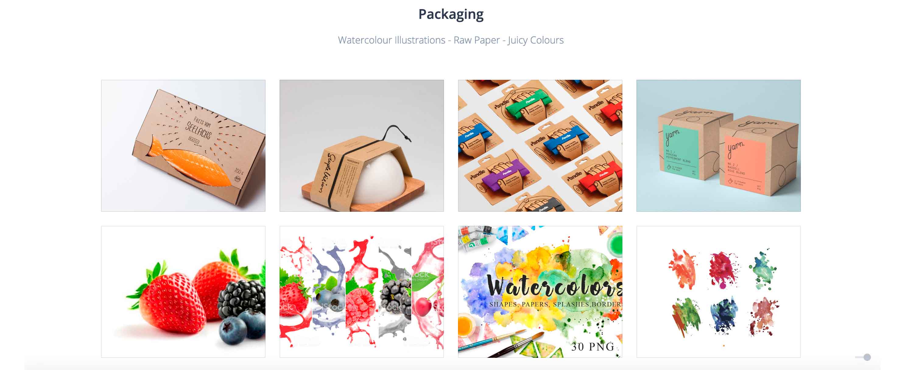
The process began with brainstorming the look and feel of the BoldBerry brand through the creation of moodboards.
The next step was to sketch all sorts of concepts for the design of the BoldBerry logo.
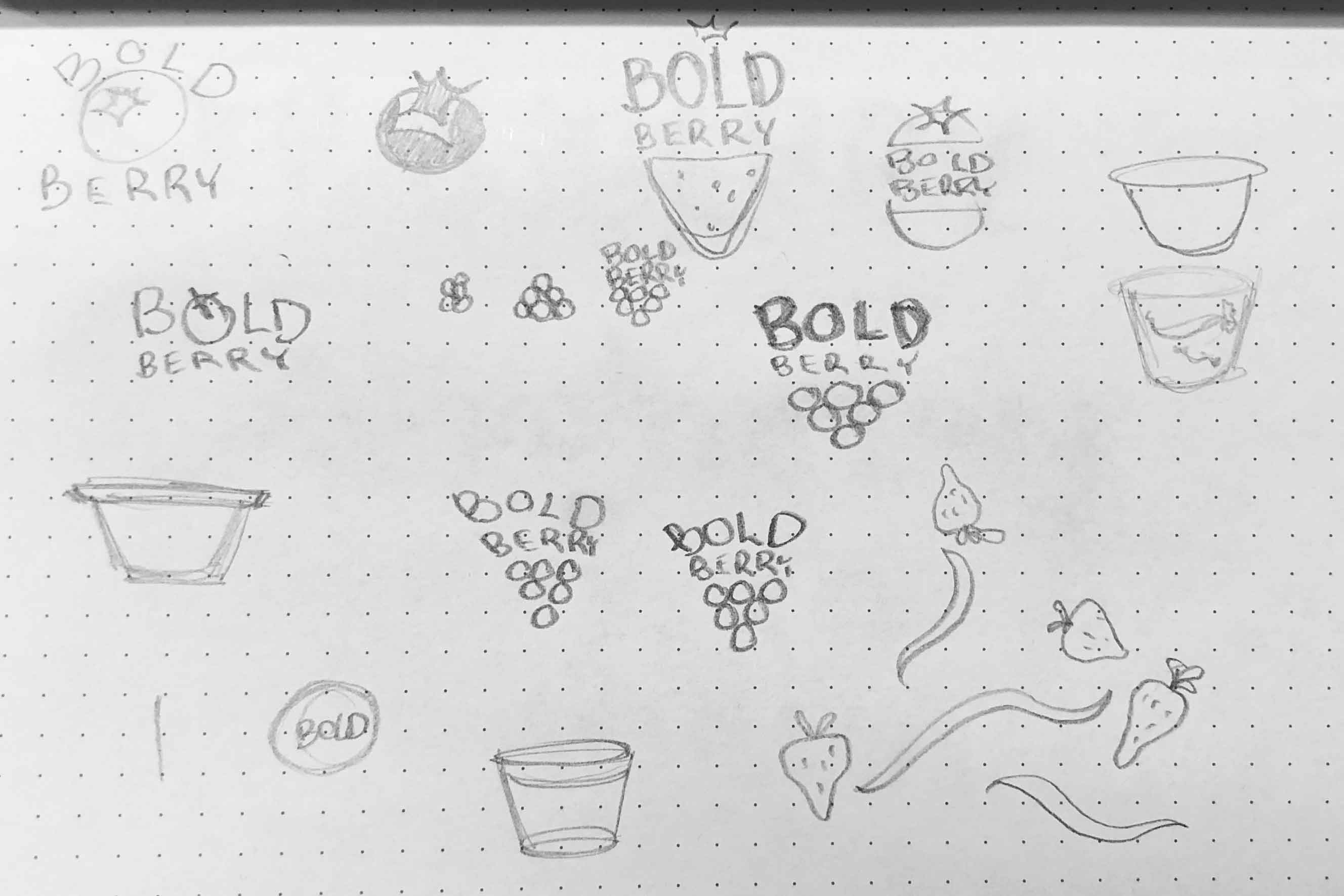
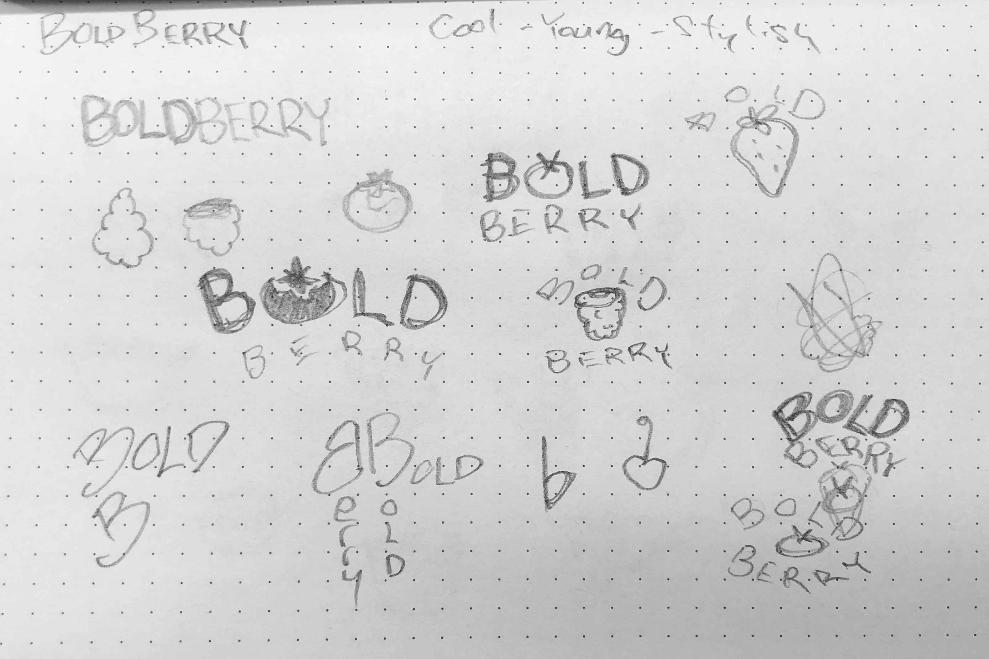
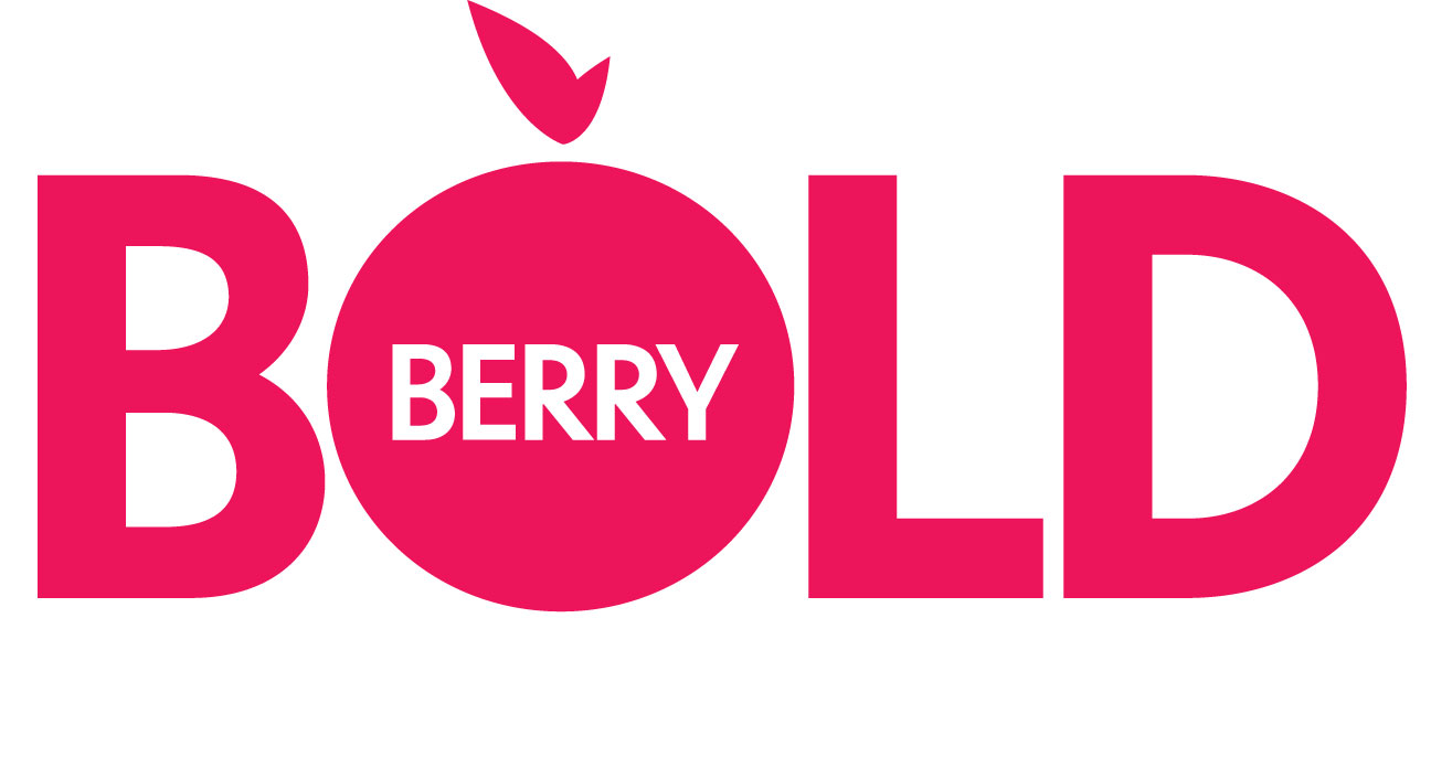
After many rounds of concept sketching, the final brand identity was created. The design is simple, bold, and stylish in order to appeal to the target audience.



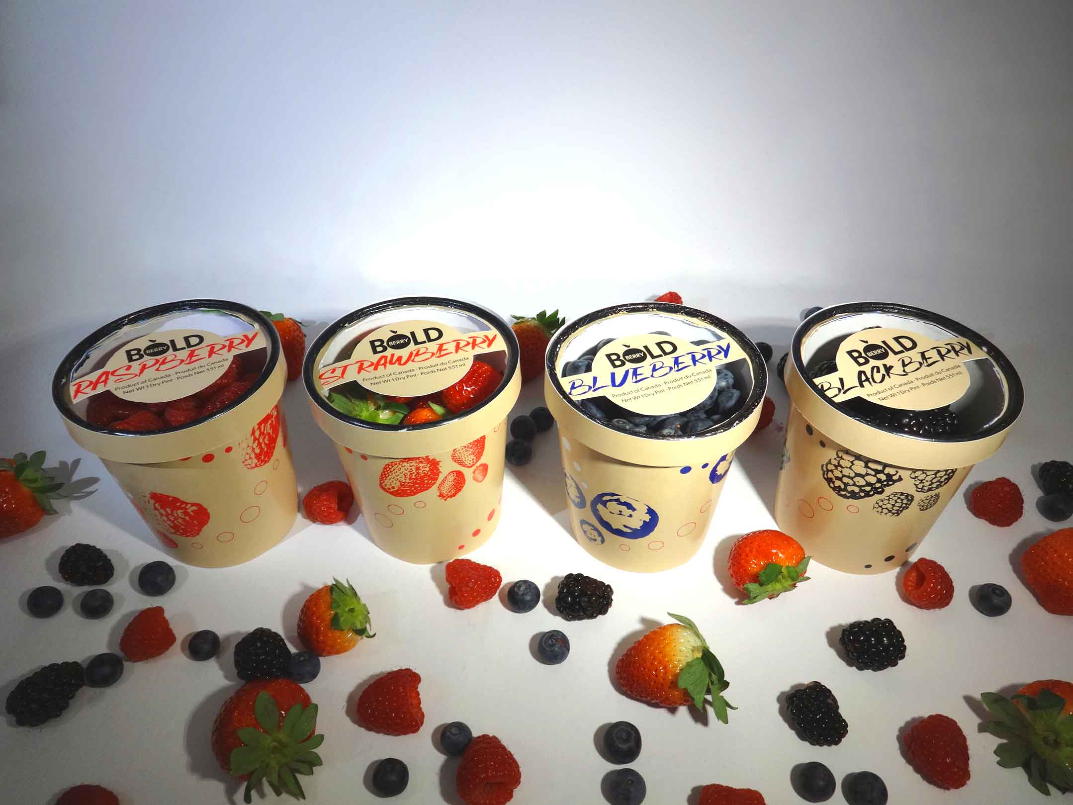
Custom lettering was drawn for the product packaging of each variety of berries. This helps the brand stand out in a more personal and unique way.


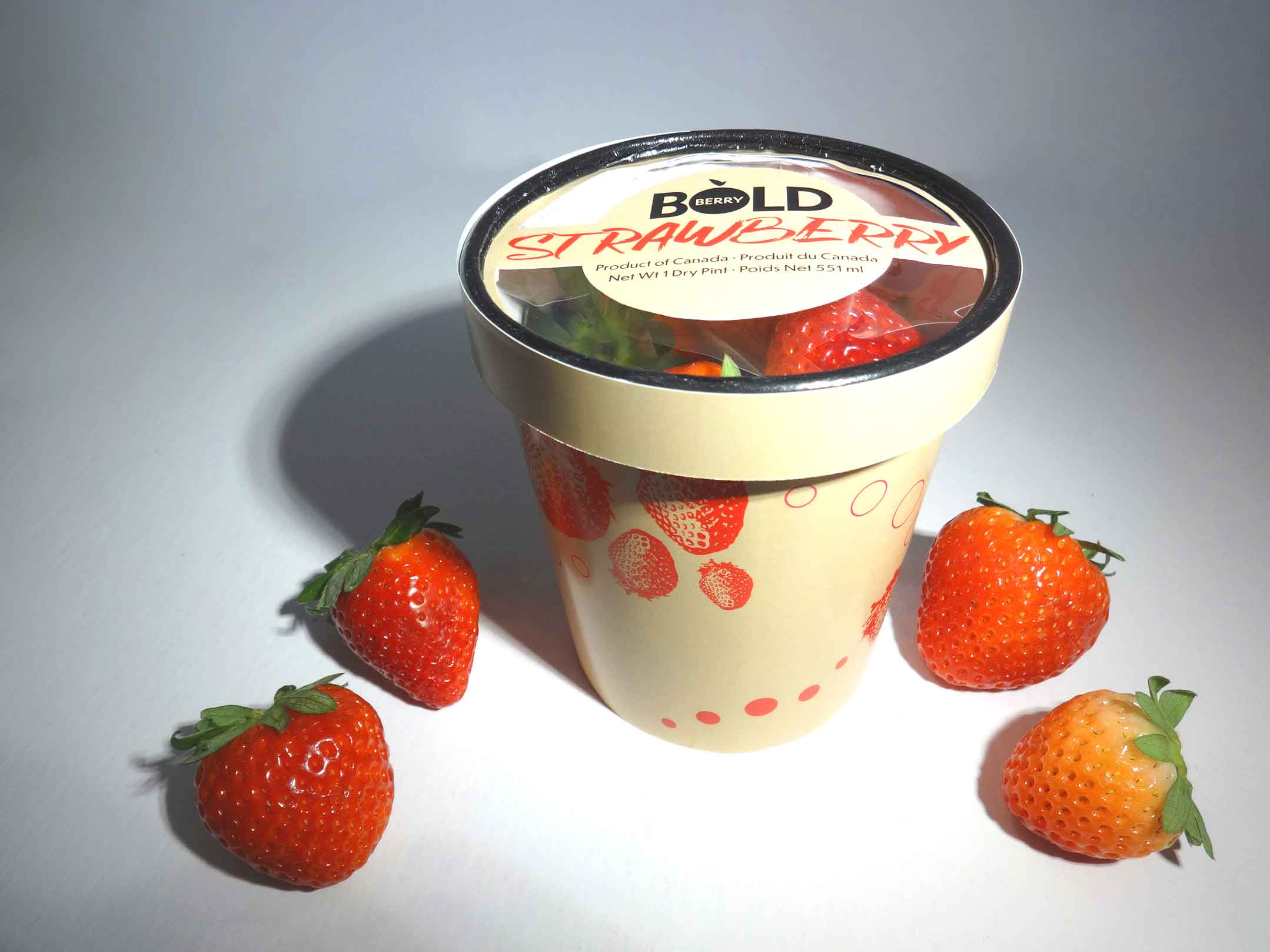
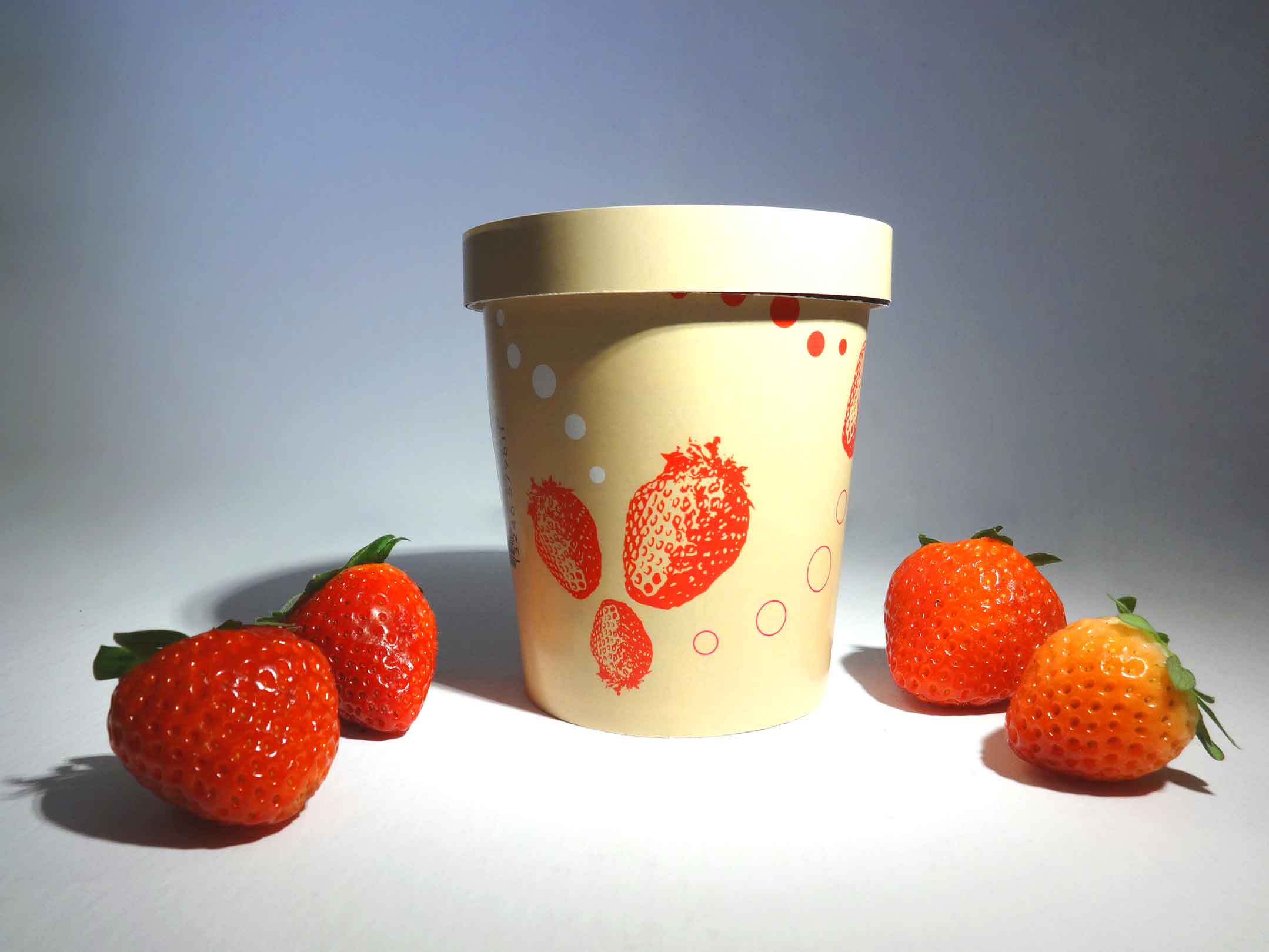
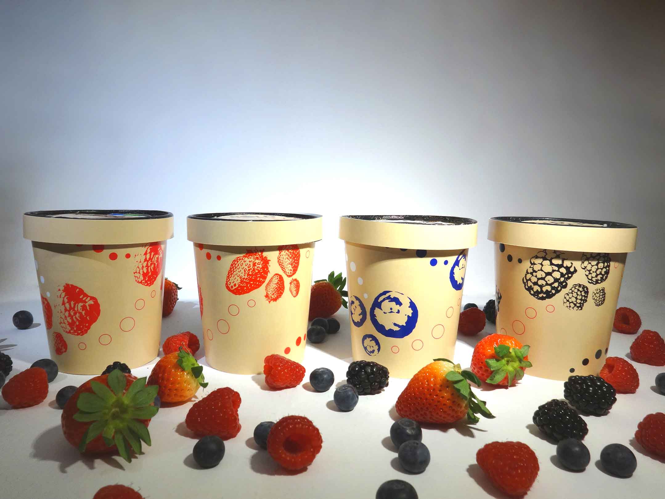
The packaging dieline used for BoldBerry products is a pint-sized ice cream style container made with a raw paper material. This packaging style completely eliminates plastic other than a thin seal under the lid. The raw paper style reflects the organic healthy nature of the products and allows the graphics to shine.
The designs are colourful, illustrative, fun, and they are designed to contrast with the logo.
These are the lids for the packaging.
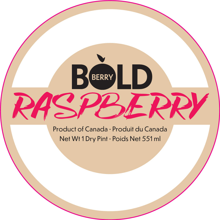
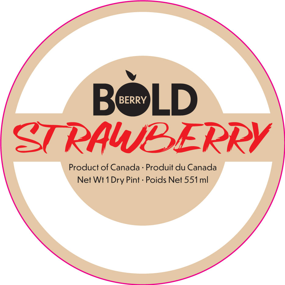
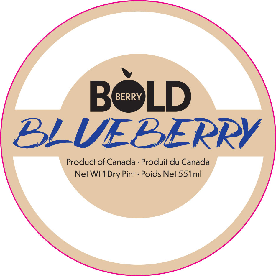
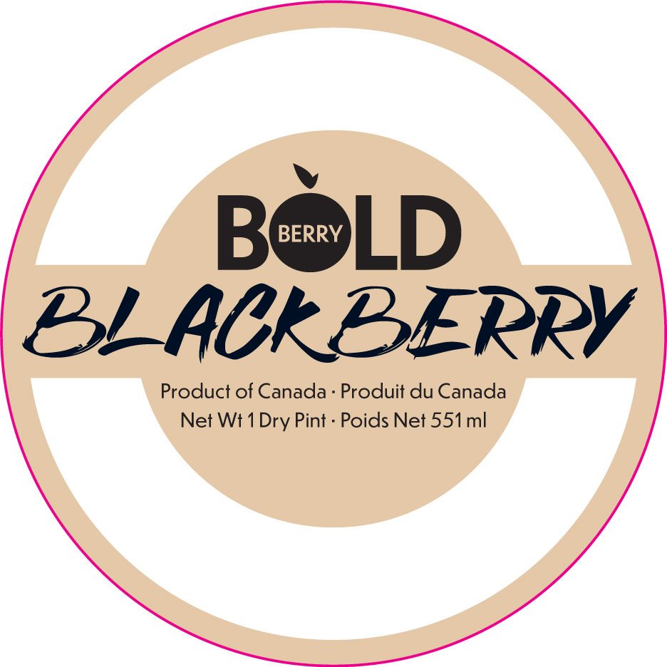
These are the labels for the packaging.
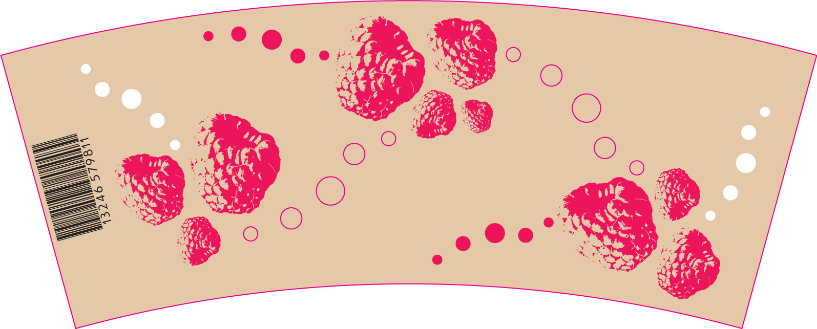
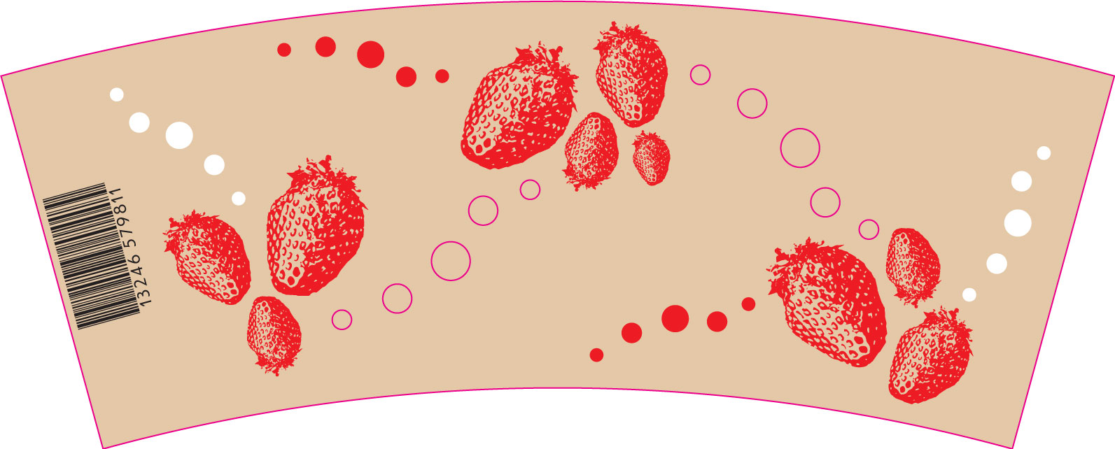
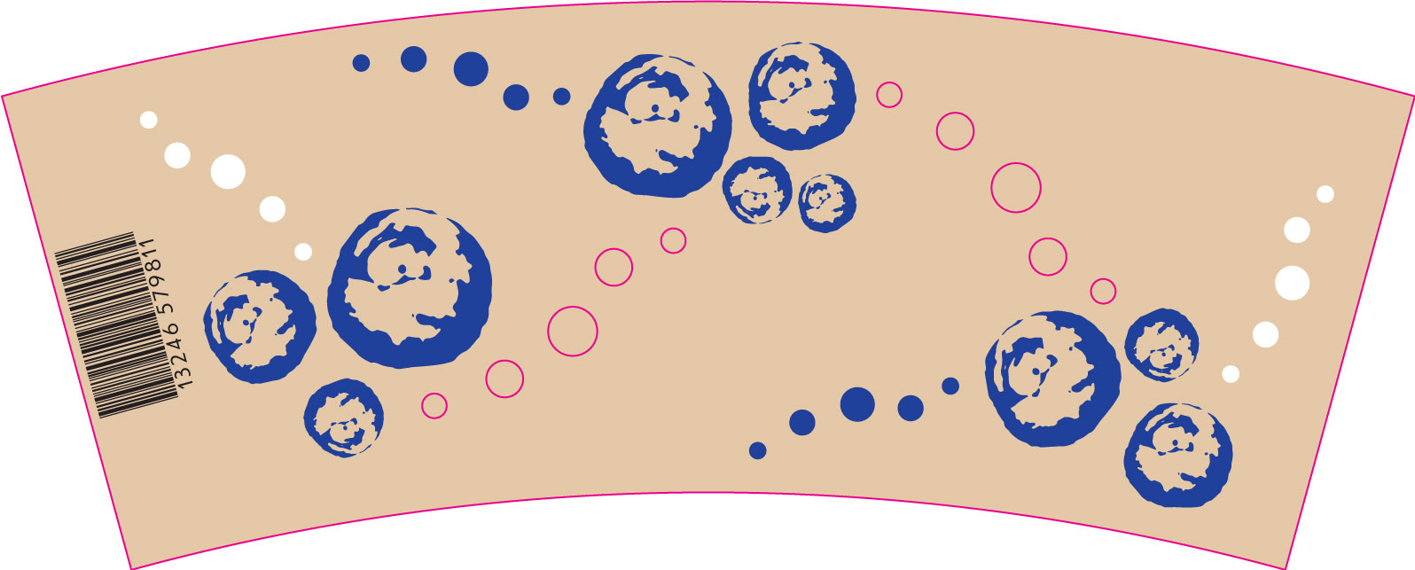
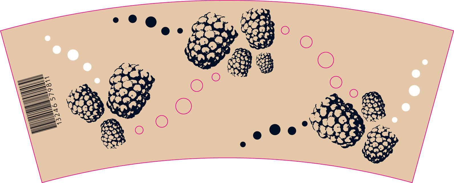
Here are some product shots of the series of packaging designs.
